What is going on with these AI Restaurant Menu Photos?
Every quarter there seems to be a new fad of AI slop. Previously AI slop posters were popular, now AI slop photos for restaurants is taking off. Although many AI fads are limited to the Bay Area Slop Containment Zone, this one seems to be exposed to the broader community.
First, let's clarify what exactly do I mean by "AI slop menus"? In a photo, this:
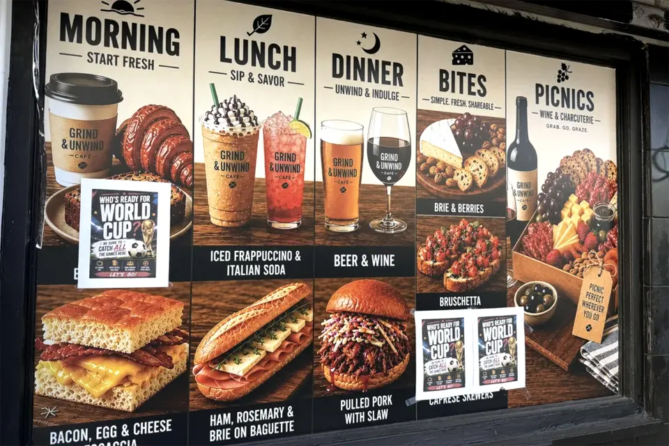
This photo was taken from https://www.sfgate.com/food/article/grind-unwind-ai-images-22348931.php (which was itself was taken from a reddit post on /r/SanFrancisco). You can now see this phenomenon popping up in more and more places. Interestingly, many of these photos across businesses seem to look very similar, maybe there is some default tool in whatever the go to menu SaaS is?
Surprisingly (or maybe not), this trend makes no sense. First of all, you don't even need photos of food. Probably the vast majority of restaurants don't have photos of their food. Second, the images serve no discernible purpose. Everyone knows what bread looks like, what does an image of bread (that isn't yours) do? It certainly isn't to look appealing as they always have some unappetizing trypophobia look. Why does it look so bad? The images always seem intentionally and aggressively artificial looking. If you just go and search for text to image generator, click on the first free one (which in my case was adobe firefly + nano banana 2) then typed "bacon, egg, and cheese focaccia", this is what you get:
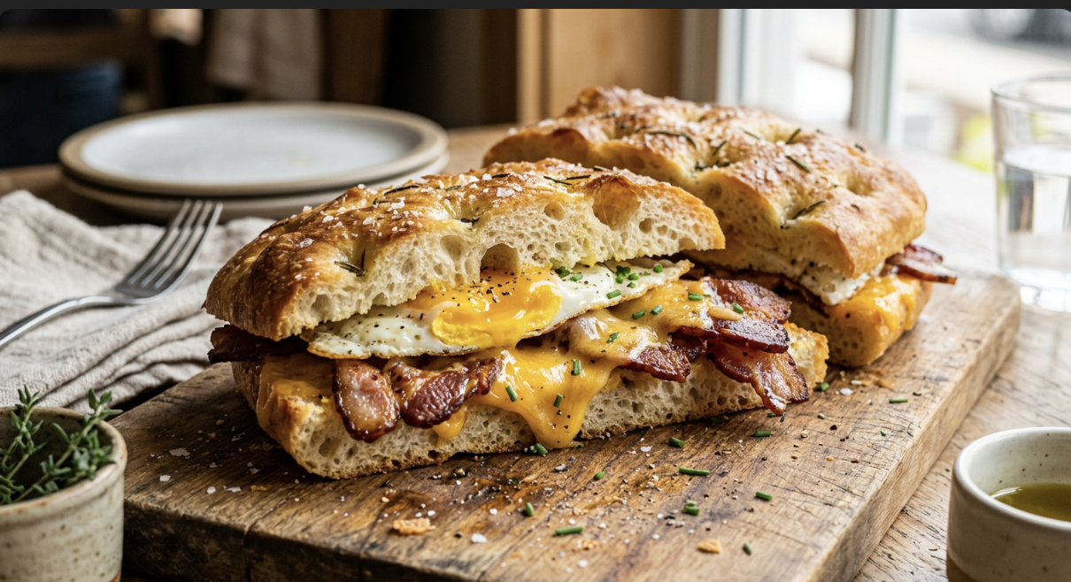
Maybe restaurateurs see the digital world overrun with slop, and think more people want it in the physical world as well.
If you do want to put some photos on your menu, why not just take actual photos of your actual food?
This was covered in a video here: https://www.youtube.com/watch?v=fxHoVT_zNQ4